Getting Started with Bottom Sheets in Android Using Kotlin Part 2 [Beginner Friendly]
Fullscreen Modal Bottom Sheet
Introduction
As discussed in part 1 of the article, a bottom sheet is an elevated surface anchored to the bottom of the screen. We also saw how it allows room for more user interface elements such as images and text.
In this article, we will create a modal bottom sheet that occupies the entire height of the screen. Remember the types of bottom sheets? Modal bottom sheet and Standard bottom sheet. In case you want to learn how to create a fullscreen standard bottom sheet, refer to this article by Narayan Panthi.
What will you learn?
By the end of the article, you will learn the following;
Creating a full-screen bottom sheet
What is a bottom sheet behavior
Different bottom sheets states
Advantages of using bottom sheets
Building the App
Similar to the modal bottom sheet we created in part 1, the fullscreen bottom sheet will extend the BottomSheetDialogFragment class. If you wish to go straight into the source code, click the GitHub link below;
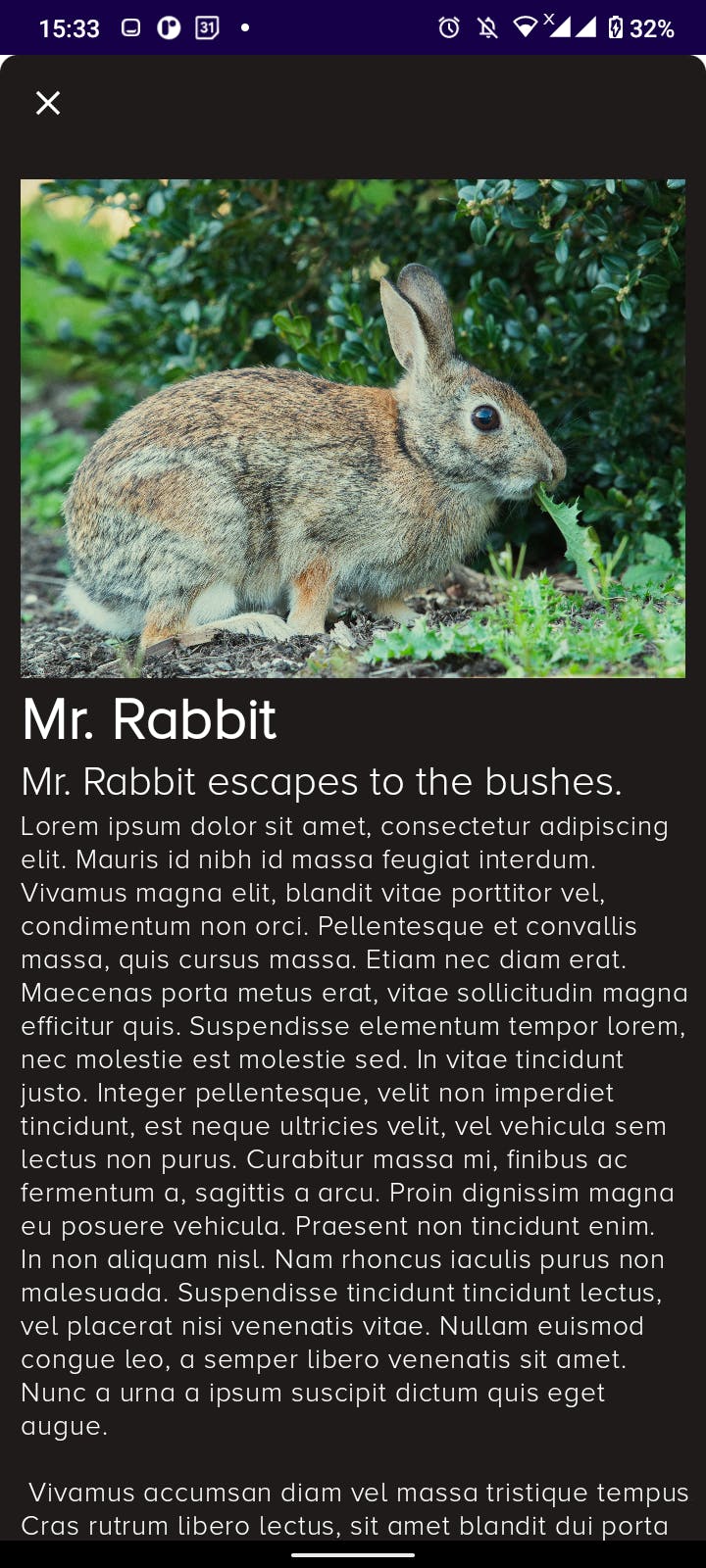
Since we had already set up the project, we will only make changes to two files and add a few resources such as text strings, images, and a drawable. The item_bottomsheet_fullscreen.xml file includes a header image, title, subtitle, and paragraph text inside a NestedScrollView. Find the source code below;
I created a toolbar that contains a close button which can be used as an alternative to swiping the bottom sheet down to dismiss it. I also added a drawable for the header image.
Difference between a modal bottom sheet and a fullscreen modal bottom sheet
So you might ask, what is the difference in implementation between the two? One thing we realize is the height. The fullscreen modal bottom sheet covers the entire screen height. How is this made possible? The peekHeight attribute. But first, we have to set the screen height to MATCH_PARENT.
// Height of the view
bottomSheet.layoutParams.height = ViewGroup.LayoutParams.MATCH_PARENT
Subsequently, define the bottom sheet behavior and apply the peekHeight attribute to it. According to official Android developer documentation,
Bottom sheet behavior is an interaction behavior plugin for a child view of CoordinatorLayout to make it work as a bottom sheet.
val behavior = BottomSheetBehavior.from(bottomSheet)
behavior.peekHeight = resources.displayMetrics.heightPixels // Pop-up height
Bottom sheet behavior states
There are six states in the bottom sheet behavior;
STATE_EXPANDED —bottom sheet is visible and its maximum height and it is neither dragging nor settling.
STATE_COLLAPSED — visible but only its peek height is shown. Usually the ‘resting position’ of a Bottom Sheet.
STATE_DRAGGING — user is actively dragging the bottom sheet up or down.
STATE_HALF_EXPANDED — the bottom sheet is half-expanded (used when fitToContents is false).
STATE_HIDDEN — the bottom sheet is hidden and no longer visible.
STATE_SETTLING — settling to a specific height after a drag/swipe gesture.
To better understand the states, check out this issue by SilverEnd on GitHub. In our project, we only use the expanded state.
behavior.state = BottomSheetBehavior.STATE_EXPANDED // Expanded state
With that understanding, you can now copy FullscreenBottomSheetDialog.kt source code below and paste it into your project;
Output

Advantages of bottom sheets
Swipeable — bottom sheets allow for an interactive user experience.
Easily Accessible — since they are anchored at the bottom of the screen, interacting with them is easy.
Conclusion
So that is a simple way to build a fullscreen modal bottom sheet in android. I hope you learned something new 😊. See you on the next one.
Peace ☮️✌️
![Getting Started with Bottom Sheets in Android Using Kotlin Part 2 [Beginner Friendly]](https://cdn.hashnode.com/res/hashnode/image/upload/v1676060231686/314ecc27-1c07-45b5-9142-46f45831daba.jpeg?w=1600&h=840&fit=crop&crop=entropy&auto=compress,format&format=webp)